
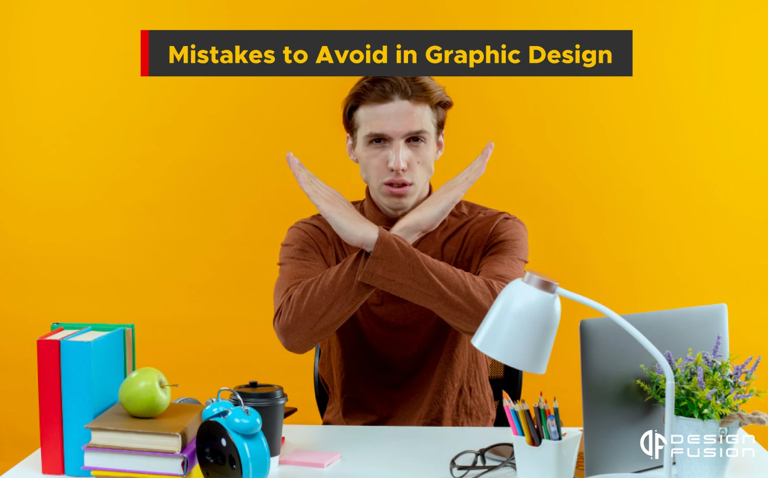
In the dynamic world of graphic design, where creativity meets functionality, there is always room for improvement. Whether you’re a seasoned designer or just starting out, steering clear of common mistakes can elevate your work to new heights. In this blog post, we’ll explore some prevalent pitfalls and offer insights on how to avoid them to ensure your designs not only catch the eye but also effectively convey the intended message.
Ignoring the Brief

Neglecting the client’s brief is a fundamental error that can have far-reaching consequences in the realm of graphic design. The client’s brief serves as the foundation upon which the entire design process is built. Here’s a closer look at why understanding project requirements, target audience, and overall goals is absolutely crucial:
Client Vision Alignment:
The client’s brief is essentially a roadmap that guides the design process. Failing to thoroughly understand and adhere to this roadmap can result in designs that miss the mark regarding the client’s vision. This misalignment can lead to dissatisfaction and, in some cases, a complete redesign, consuming valuable time and resources.
Audience Relevance:
Each design is crafted with a specific audience in mind. Neglecting to consider the target audience outlined in the brief can result in designs that don’t resonate with the intended viewers. Design elements that don’t connect with the audience can lead to a lack of engagement and, ultimately, the failure of the design to fulfill its purpose.
Failure to Meet Goals:
Graphic design is more than just creating visually appealing artwork; it’s about achieving specific objectives. Whether the goal is to increase brand awareness, drive sales, or communicate a particular message, a clear understanding of the project’s overall goals is essential. Ignoring this aspect of the brief can result in designs that fall short of achieving the intended outcomes.
Wasted Resources:
Designing without a solid understanding of the client’s brief can lead to wasted time and resources. The client’s brief serves as a valuable resource that streamlines the design process, helping designers focus their efforts on elements that truly matter. Neglecting this foundational step can result in the need for revisions and adjustments, consuming additional resources that could have been avoided.
Damage to Client Relationship:
Neglecting the client’s brief can strain the designer-client relationship. Clients rely on designers to bring their vision to life, and when that vision is not accurately translated into the design, it can lead to frustration and disappointment. A breakdown in communication can harm the trust between the client and the designer, potentially impacting future collaborations.
Overlooking Typography:

Typography indeed plays a pivotal role in graphic design, acting as the backbone that can either elevate or undermine the overall visual impact of a design. Here’s a closer look at why paying careful attention to typography is crucial for creating effective and aesthetically pleasing designs:
Font Selection Matters:
Choosing the right font is akin to selecting the appropriate tone of voice for a piece of writing. Different fonts convey different emotions and messages. Neglecting this can result in a design that feels off-kilter or misaligned with the intended message. For example, a whimsical script font may not be suitable for a serious corporate report.
Improper Spacing Can Distract:
The spacing between letters, known as kerning, and the spacing between lines, known as leading, significantly impact readability. Poorly spaced typography can distract the viewer and make the text difficult to read. On the other hand, well-balanced spacing enhances readability and contributes to a clean, professional appearance.
Readability is Non-Negotiable:
Graphic design is not just about making something look good; it’s about effectively communicating a message. If the chosen font is difficult to read, the entire purpose of the design is compromised. Ensure that your typography choices prioritize readability to convey the intended message clearly and efficiently.
Consistency is Key:
Consistency in typography across different elements of a design or a brand is crucial for building a cohesive visual identity. Using a haphazard mix of fonts can create confusion and dilute the overall impact of the design. Establishing a consistent typography style contributes to brand recognition and a polished aesthetic.
Hierarchy Guides the Viewer:
Establishing a clear hierarchy in typography helps guide the viewer’s eyes through the design in a logical and meaningful way. Important information should be emphasized through font size, weight, or style to ensure that the viewer grasps the most critical elements of the message at a glance.
Consider the Context:
The context of the design and the intended audience should influence your typography choices. A formal document may require a different font than a playful poster. Understanding the context ensures that your typography aligns with the overall theme and purpose of the design.
Color Catastrophes:

Color is a powerful tool in the hands of a graphic designer, capable of evoking emotions, setting moods, and conveying messages. Choosing the right color palette is a critical aspect of design that should never be underestimated. Let’s delve into why being mindful of color theory is essential for creating a design that resonates with the audience:
Emotional Impact:
Colors have the unique ability to evoke emotions and feelings. Warm colors like reds and yellows can convey energy and passion, while cool colors like blues and greens often evoke calmness and serenity. Understanding the emotional impact of colors allows designers to elicit specific responses from the audience, creating a more engaging and immersive experience.
Audience Connection:
Different demographics and cultures associate varying meanings with colors. A color that symbolizes positivity in one culture might represent something entirely different in another. Neglecting to consider the cultural context of color can lead to a disconnect with the audience. Being mindful of these associations helps ensure that your color choices resonate positively with your target audience.
Brand Identity:
For businesses and brands, color is a crucial element of identity. Consistency in color across marketing materials fosters brand recognition and reinforces the brand’s personality. Deviating from established color schemes can dilute brand identity and confuse consumers. Mindful use of color maintains a cohesive brand image.
Contrast and Legibility:
In addition to conveying emotions, colors play a significant role in enhancing contrast and legibility. Poorly chosen color combinations can make text difficult to read or important elements challenging to discern. Mindful consideration of color theory ensures that your design is visually appealing while maintaining clarity and readability.
Psychological Considerations:
Color psychology explores the impact of colors on human behavior and decision-making. For example, blue is often associated with trust and professionalism, making it a common choice for corporate branding. Understanding these psychological nuances allows designers to leverage colors strategically to influence the audience’s perception and response to the design.
Harmony and Balance:
Color theory encompasses principles of harmony and balance, guiding designers in creating visually pleasing compositions. Analogous color schemes, complementary contrasts, or monochromatic palettes can all contribute to a harmonious and balanced design. Mindfully applying these principles ensures that the color elements work together seamlessly.
Accessibility and Inclusivity:
A well-thought-out color palette also considers accessibility for all users, including those with visual impairments. High contrast between text and background colors improves readability, and designers should be mindful of creating designs that are inclusive and accessible to a diverse audience.
Cluttered Composition:

The principle that “less is more” holds a special place in the world of graphic design, emphasizing the importance of simplicity and clarity. Let’s explore why embracing whitespace and avoiding overcrowded compositions are crucial for creating visually appealing and effective designs:
Visual Hierarchy:
Whitespace, also known as negative space, plays a vital role in establishing visual hierarchy within a design. Strategic use of whitespace directs the viewer’s attention and guides them through the content in a logical order. This, in turn, helps to emphasize key elements, creating a clear and effective visual hierarchy.
Reduced Cognitive Load:
Overcrowded designs bombard the viewer with excessive information, leading to cognitive overload. By embracing whitespace, designers allow the audience’s minds to process information more easily. The reduction in cognitive load ensures that the viewer can focus on the essential elements without feeling overwhelmed.
Enhanced Readability:
Whitespace contributes significantly to the readability of a design. Ample spacing between text, images, and other elements prevents visual clutter and allows the viewer to absorb information effortlessly. It also improves legibility by preventing text from blending into the background or other design elements.
Clear Focal Point:
Whitespace helps establish a clear focal point in a design. By providing breathing room around a central element, whether it’s an image, headline, or call-to-action, designers can ensure that the viewer’s attention is drawn to the most critical aspect of the composition. This clarity strengthens the impact of the intended message.
Aesthetic Appeal:
Negative space enhances the overall visual attractiveness of a design. Clean, uncluttered layouts often appear more sophisticated and visually pleasing. The intentional use of whitespace allows design elements to stand out, creating a more refined and professional look.
Mobile Responsiveness:
With the prevalence of mobile devices, where screen real estate is limited, the importance of whitespace becomes even more evident. Overcrowded designs can be particularly challenging to navigate on smaller screens. Embracing whitespace ensures that the design remains visually engaging and user-friendly across various devices.
Conveys Simplicity and Elegance:
Minimalist designs, characterized by the effective use of whitespace, convey a sense of simplicity and elegance. The deliberate choice to include only essential elements not only looks modern but also communicates a focused and refined message.
Encourages Focus on Key Elements:
Whitespace allows designers to showcase key elements without distractions. Whether it’s a product, a message, or a visual metaphor, an uncluttered design ensures that these elements receive the attention they deserve, making the overall communication more effective.
Ignoring Brand Consistency:

Branding is the essence of a company’s identity, and maintaining consistency is the cornerstone of a successful brand strategy. Designers working on branding projects play a pivotal role in upholding the integrity of a brand. Here’s why adhering to established brand guidelines is paramount for preserving brand identity and ensuring a cohesive visual representation:
Establishes Brand Recognition:
Consistency in design elements, such as logos, color schemes, and typography, helps create a recognizable brand identity. When customers encounter consistent visuals across various touchpoints, they form a strong association with the brand. This recognition is vital for brand recall and building trust over time.
Builds Trust and Credibility:
A consistent brand image instills trust and credibility in the minds of consumers. When the visual elements remain constant, it conveys a sense of reliability and professionalism. Deviating from established brand guidelines can erode this trust, leading to confusion and a potential loss of confidence in the brand.
Facilitates Seamless Communication:
Brands communicate not just through words but also through visuals. Consistency ensures that this communication remains clear and coherent. When designers adhere to brand guidelines, the brand’s messaging is reinforced through a visual language that resonates with the target audience.
Creates a Cohesive Brand Experience:
Branding is more than just a logo; it’s about creating a holistic brand experience. Consistent design elements across various platforms, from print materials to digital media, contribute to a cohesive and unified brand presence. This unified experience reinforces the brand’s values and personality.
Supports Marketing Efforts:
Marketing campaigns are most effective when they align with the established brand image. Inconsistent design choices can dilute the impact of marketing efforts and lead to mixed messages. Adhering to brand guidelines ensures that every marketing initiative contributes to building a strong and coherent brand story.
Saves Time and Resources:
Brand guidelines serve as a reference point for designers, streamlining the design process. They provide a framework for color choices, typography, and other visual elements, saving time that would otherwise be spent on decision-making. This efficiency is particularly valuable when working on various design projects within a tight timeframe.
Prevents Confusion Amongst Stakeholders:
A brand is a shared asset among stakeholders, including designers, marketing teams, and executives. Consistency in design elements prevents confusion and ensures that everyone involved in the brand’s representation is on the same page. This alignment is crucial for maintaining a unified brand voice.
Adapts to Evolution Without Losing Identity:
Over time, brands may evolve, and updating brand guidelines is a natural part of this process. Adapting the design to changes while maintaining consistency ensures that the brand remains relevant without losing its core identity. This delicate balance is key to a successful brand evolution.
Poor Image Resolution:
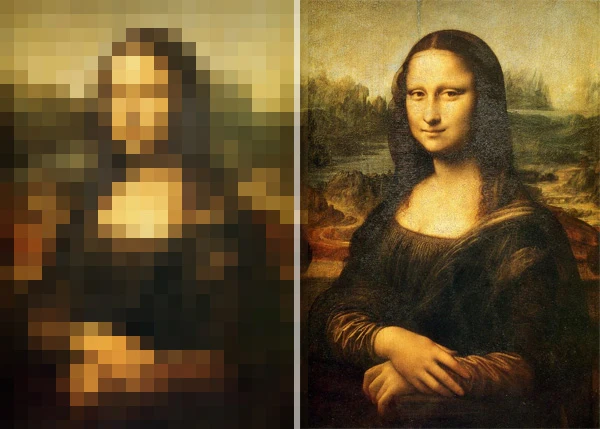
In the realm of graphic design, the quality of images used can make or break the overall impact of a design. High-quality images serve as the backbone of compelling designs, ensuring clarity, professionalism, and a visually pleasing end result. Here’s why paying attention to image resolution is crucial for designers, particularly when working on print materials:
Avoids Pixelation:
Neglecting image resolution can lead to pixelation, where individual pixels become visible, causing a loss of detail and sharpness. Pixelated images not only look unprofessional but also distract from the intended message of the design. Using high-resolution images prevents this issue, preserving the quality and integrity of the visual elements.
Enhances Print Quality:
When designing materials for print, image resolution becomes even more critical. Printers require higher resolution images to reproduce designs accurately. Low-resolution images may look fine on a digital screen but can translate poorly to print, resulting in a final product that lacks the crispness and detail expected in professional print materials.
Professional Aesthetics:
High-resolution images contribute to the overall professional aesthetics of a design. They communicate a dedication to precision and a steadfast commitment to high standards. In contrast, low-resolution or pixelated images can give the impression of a rushed or amateurish design, undermining the credibility of the content.
Retains Detail and Clarity:
Whether it’s a photograph, an illustration, or a logo, high-resolution images retain the intricate details and clarity that make the visual elements stand out. This is especially important for conveying intricate patterns, textures, or fine lines that might be lost in lower resolution versions.
Consistent Branding:
For brand consistency, it’s crucial to use high-resolution versions of logos and brand elements. Consistency in image quality across various materials, both digital and print, reinforces the brand’s commitment to quality and attention to detail. It also ensures that the brand’s visual identity remains strong and recognizable.
Versatility Across Platforms:
High-resolution images offer versatility across different platforms and mediums. Whether your design is intended for a website, a social media post, or a print brochure, using high-resolution images ensures that your design looks professional and maintains its impact across various channels.
Future-Proofing Designs:
Designers should consider the longevity of their work. High-resolution images future-proof designs, allowing them to be used in a variety of contexts over time. This is particularly important for branding materials, where consistency and durability are key.
Print Requirements:
Print materials often have specific resolution requirements to ensure optimal printing results. Printers typically recommend a minimum resolution for images to guarantee sharp, high-quality prints. Adhering to these requirements is essential to achieving the desired print outcome.
Conclusion
By steering clear of these common graphic design pitfalls, you can elevate your work and ensure that your designs not only captivate but also effectively communicate the intended message. Remember, the path to mastery is paved with learning from mistakes, so embrace each design challenge as an opportunity for growth.