
In the world of design, aesthetics play a crucial role in capturing the attention of the audience. The use of colour is one of the most powerful tools at a designer’s disposal. It can evoke emotions, convey messages, and influence user behaviour. In this blog post, we will delve into the fascinating realm of colour psychology and how it can be harnessed to create visually captivating and effective website designs and creative works. Whether you’re a web designer, digital marketer, or simply someone interested in the impact of colours on human perception, this article is for you.
Understanding Colour Psychology
Colour psychology is the study of how different colours can impact human emotions, behaviour, and perceptions. It explores the way people respond to various colours on a psychological and emotional level. By understanding these associations, designers can strategically use colours to convey specific messages, trigger desired emotions, and guide user actions.
The Connection Between Colour and Website Design
- First Impressions Matter
They say you only get one chance to make a first impression, and this holds true for websites as well. When a user lands on a webpage, their initial perception is often driven by the colour scheme. Colours can convey an immediate sense of professionalism, creativity, or trustworthiness.
Example: A website predominantly using muted earth tones might be perceived as environmentally conscious or rustic, while one featuring bold, vibrant colours may come across as energetic and modern.
- Building Emotional Connections
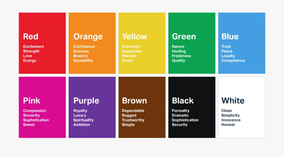
Colours have the remarkable ability to evoke emotions and feelings. Different colours can trigger various emotional responses in users. For instance:- Red: Excitement, urgency, passion
- Blue: Trust, tranquillity, reliability
- Green: Growth, health, nature
- Yellow: Optimism, warmth, clarity
- Purple: Luxury, creativity, sophistication
- By carefully selecting colours that align with the intended emotional tone of a website, designers can create a deeper emotional connection with users.
- Navigational Clarity
Effective website design goes beyond aesthetics; it also encompasses functionality. Colours play a critical role in improving navigational clarity.
Example: Using a contrasting colour for hyperlinks and buttons helps users easily identify interactive elements. A call-to-action button in a contrasting colour can guide users toward desired actions, such as making a purchase or signing up for a newsletter.
- Brand Identity and Recognition
For businesses and organizations, branding is paramount. Colours are a key component of brand identity. Consistency in colour usage across all brand assets, including the website, reinforces brand recognition.
Example: McDonald’s signature red and yellow colour scheme is instantly recognizable and evokes feelings of warmth and comfort. This consistency extends to their website, creating a seamless brand experience.
- Cultural Considerations
When designing websites for a global audience, it’s essential to consider cultural preferences and associations with colours. What might be considered lucky or auspicious in one culture could have a different connotation in another.
Example: While red symbolizes luck and joy in Chinese culture, it can signify danger or caution in Western cultures. Designers need to be sensitive to these cultural nuances to create inclusive and effective websites.
- Responsive Design and Accessibility
Colour choices also play a role in ensuring a website is accessible to all users, including those with visual impairments. The use of colour contrast is critical for readability and usability. Designers should adhere to accessibility guidelines to ensure that their websites are inclusive.

Creative Design and Colour Psychology
Creativity and design are inextricably linked, forming a dynamic partnership that captures attention, conveys messages, and inspires action. At the heart of this creative synergy lies colour psychology, a captivating discipline that explores the emotional and psychological impact of colours. In this article, we’ll embark on a journey into the fascinating world of creative design and colour psychology, discovering how the strategic use of colours can breathe life into artistic expressions, branding, and communication.
- Emotional Resonance through Colours
Colours possess a unique ability to evoke emotions and resonate with viewers on a deep level. Creative designers leverage this power to craft visual narratives that connect with audiences emotionally.
Example: A poster for an adventure film might use vibrant, bold colours like red and orange to evoke excitement and adrenaline, while a poster for a romance movie may opt for soft, pastel shades like pink and lavender to convey love and tenderness.
- Cultural Significance
Beyond emotional impact, colours also carry cultural significance. Different cultures attach various meanings and symbolism to colours, making it crucial for designers to consider these cultural nuances when creating visuals for a global audience.
Example: White symbolizes purity and mourning in many Western cultures, while it represents happiness and celebration in some Asian cultures. A lack of cultural sensitivity in colour choices can lead to misunderstandings.
- Branding and Identity
For businesses and organizations, branding is a cornerstone of recognition and loyalty. Colours are central to establishing and maintaining brand identity.
Example: The iconic red and white of Coca-Cola or the vibrant primary colours of Google are instantly recognizable, forming a strong brand identity. Creative designs consistently employing these colours reinforce brand recognition.
- User Engagement
Colour psychology extends to user engagement in digital and print media. In creative marketing materials, colours can guide users’ attention and actions.
Example: A brightly coloured “Shop Now” button on an e-commerce website draws attention and encourages users to make a purchase. Skilful use of colour can enhance user experiences and conversions.
- Expressing Creativity
Creative designers use colour to express their unique artistic visions and convey specific moods or themes. Whether it’s a painter, graphic designer, or interior decorator, colours are their palette for creative expression.
Example: An abstract artist may use a riot of colours to evoke chaos and energy, while a minimalist designer might employ a limited colour scheme to create a sense of calm and simplicity.
- Communication and Visual Storytelling
colours are a language in themselves, capable of communicating without words. They play a pivotal role in visual storytelling, aiding in the conveyance of complex ideas and narratives.
Example: In infographic design, colours can differentiate data categories, making information more accessible and engaging. A green colour associated with growth can signify positive trends, while red can signal caution or decline.
Digital Marketing and Colour Psychology
- Emotional Engagement through Colours
Colours are emotional triggers. They have the remarkable ability to evoke feelings, making them invaluable in digital marketing campaigns.
Example: A healthcare app may use soothing shades of blue and green to create a sense of trust and tranquillity, while a youth-oriented mobile game might employ vibrant, energetic colours like red and yellow to elicit excitement and enthusiasm.
- Brand Recognition and Consistency
Branding is at the core of digital marketing success. Colours play a pivotal role in establishing and maintaining brand identity.
Example: Social media giants like Facebook and Twitter consistently use their brand colours—blue and light blue and blue and white, respectively—across their platforms. This consistent colour usage reinforces brand recognition, even in the absence of logos or names.
- Creating Visual Hierarchies
In digital marketing materials, the strategic use of colour can create visual hierarchies that guide users’ attention to specific elements.
Example: Using a contrasting colour for call-to-action buttons (e.g., a bold red “Buy Now” button) makes it visually prominent and encourages users to take the desired action, such as making a purchase or signing up for a newsletter.
- Cultural Considerations in Global Marketing
For global marketing campaigns, understanding cultural associations with colours is essential. What may be considered a lucky colour in one culture could hold different connotations elsewhere.
Example: Red is associated with luck and celebration in Chinese culture but is often associated with caution or danger in Western cultures. A misstep in colour choice can alienate or confuse an international audience.
- Email Marketing and Click-Through Rates
In email marketing, the use of colour can significantly impact open rates and click-through rates. It’s not just about making emails visually appealing; it’s about using colours strategically.
Example: Employing the colour green for action buttons in emails can signify “go” or success, making it effective for encouraging recipients to click on links or make a purchase.
- Psychological Triggers in Advertising
Colours serve as psychological triggers in digital advertising. They can create a sense of urgency, establish trust, or convey specific messages.
Example: Red is often used in limited-time offer advertisements to create a sense of urgency, while blue can be employed in financial or insurance ads to convey trustworthiness and reliability.
Conclusion
The significance of colour psychology in design cannot be emphasized enough. Whether you are designing a website, creating stunning visual content, or planning a digital marketing campaign, the strategic use of colours can profoundly influence your audience’s perception and behaviour. By aligning your design choices with the emotions and messages you wish to convey, you can enhance the impact of your creative designs and ultimately drive success in the digital realm. Stay creative, stay colourful, and watch your designs transform into compelling works of art.
Remember, the journey to mastering colour psychology is an ongoing one. Continuously learning and experimenting with different colour combinations will lead to more effective and engaging designs in the ever-evolving world of web design, creative design, and digital marketing.