
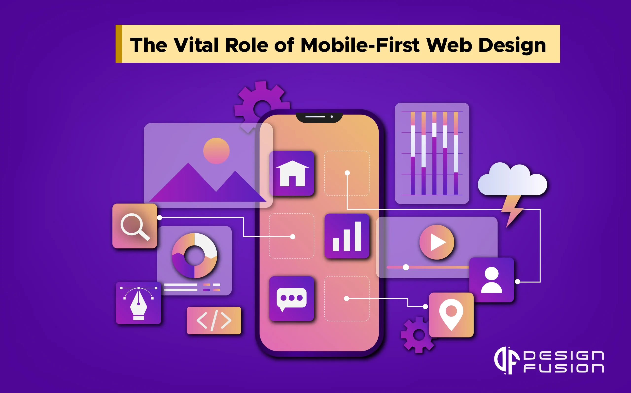
In the ever-evolving landscape of website development and design, staying ahead of the curve is crucial to maintaining a competitive edge. As we step into 2023, one thing is abundantly clear: mobile-first web design is no longer just a trend; it’s a necessity. In this blog, we’ll explore the significance of mobile-first design and its impact on website development.
The Mobile Revolution
With smartphones and tablets becoming an integral part of our daily lives, it’s no surprise that mobile web traffic has surged. In fact, mobile devices account for a significant portion of all web traffic, and this trend is only expected to continue.
What is Mobile-First Web Design?
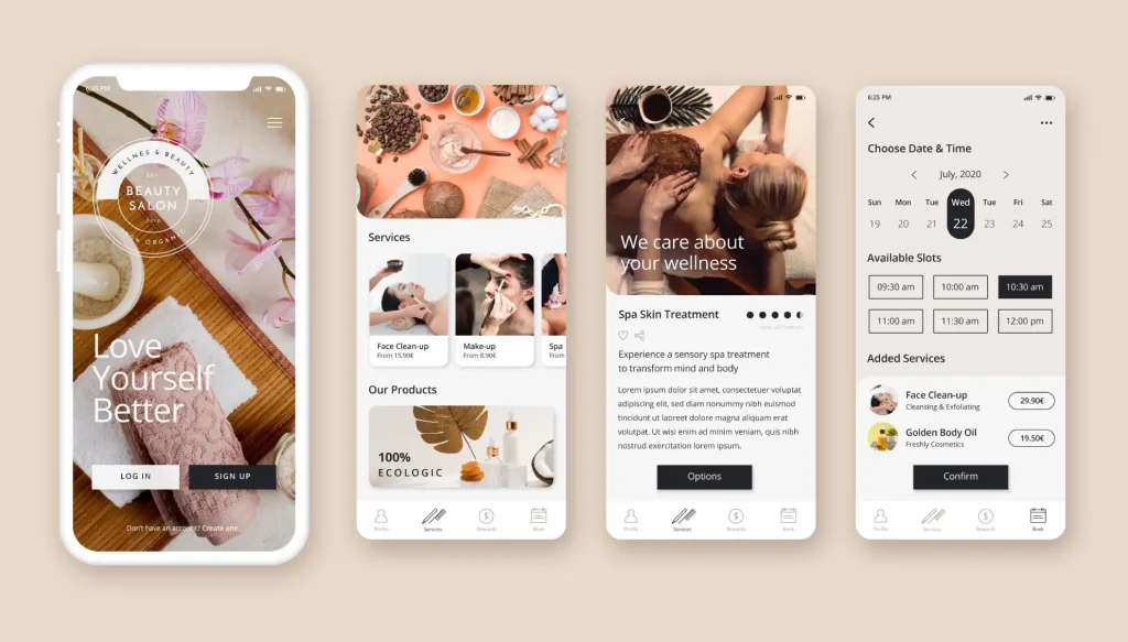
Mobile-First Web Design is a modern approach to web development that recognizes the significance of mobile devices in our digital landscape. It centres on designing and optimizing websites with mobile users as the primary audience. By starting the design process with the smallest screens in mind, Mobile-First Web Design ensures that users on smartphones have a seamless and user-friendly experience. This approach prioritizes responsive design, streamlined navigation, fast loading times, and touch-friendly elements. It also aligns with mobile SEO best practices, enhancing a website’s visibility in mobile search results. As mobile usage continues to soar, embracing Mobile-First Web Design is not just a design trend but a strategic imperative to create websites that cater to the needs of today’s diverse user base.
Why Mobile-First Matters
In an era where smartphones have become extensions of ourselves and the go-to tool for accessing information, it’s no exaggeration to say that mobile devices have transformed our lives. As we dive into the digital landscape of 2023, one thing is abundantly clear: Mobile-First Web Design isn’t just a design philosophy; it’s a necessity. In this blog, we’ll delve into why Mobile-First Web Design matters more than ever.
- User-Centric Approach
Mobile-First Web Design starts with the user. It prioritizes the mobile user experience above all else. After all, mobile users have distinct needs and behaviours. They seek quick access to information, easy navigation, and fast-loading times. A Mobile-First approach ensures that your website caters to these needs, delivering a seamless and satisfying experience.
- SEO Benefits
Search engines, led by the ubiquitous Google, have embraced mobile-first indexing. This means that Google, for the most part, uses the mobile version of the content for ranking. If your website isn’t mobile-friendly, it could suffer in search engine rankings, potentially impacting your online visibility and traffic. For website development and design, this can be a game-changer.
- Speed and Performance
Mobile-First design isn’t just about fitting content on smaller screens; it’s also about optimizing performance. Mobile users are often on the move and may have limited bandwidth or slower connections. The mobile-First design emphasizes speed and performance optimization, which is crucial for keeping users engaged and reducing bounce rates.
- Adaptation to Multiple Devices
A mobile-first approach doesn’t mean neglecting larger screens. Instead, it lays the foundation for a responsive design that adapts smoothly to various screen sizes and resolutions. Whether it’s a smartphone, tablet, or desktop computer, your website should provide a consistent and engaging experience.
- Competitive Advantage
As more businesses recognize the importance of Mobile-First Web Design, those who adapt early gain a competitive advantage. Users are more likely to engage with and trust websites that are easy to use on their mobile devices. A well-optimized mobile site can set you apart from competitors.
Key Steps in Mobile-First Web Design
To embrace mobile-first web design in 2023, consider the following key steps:
- Content Prioritization: Start by identifying and prioritizing the most important content and features for your mobile users. Consider what information is essential for users on smaller screens and what can be relegated to larger screens.
- Responsive Design: Build a responsive layout that adapts seamlessly to various screen sizes and resolutions. Use fluid grids and flexible images to ensure that your website looks and functions well on both small and large screens.
- Mobile-Friendly Navigation: Streamline your website’s navigation to make it user-friendly on mobile devices. Use clear and concise menus, and consider using mobile-friendly navigation patterns like the hamburger menu.
- Typography and Readability: Choose legible fonts and font sizes that are comfortable to read on small screens. Be mindful of the spacing between lines and the level of contrast to guarantee easy readability.
- Optimize Images: Optimize images for mobile devices to reduce loading times. Use responsive images and consider using modern image formats like WebP for better compression.
- Performance Optimization: Mobile users often have slower internet connections, so it’s crucial to optimize your website’s performance. Minimize HTTP requests, leverage browser caching, and use content delivery networks (CDNs) to improve loading speed.
- Touch-Friendly Elements: Design touch-friendly buttons and interactive elements. Ensure that buttons and links are large enough to tap easily with a finger, and provide enough spacing to prevent accidental clicks.
- Progressive Enhancement: After creating a solid mobile design, progressively enhance it for larger screens. Add additional features, content, and design elements as screen real estate allows. This method guarantees a uniform user experience on all types of devices.
- Media Queries: Use CSS media queries to apply different styles and layouts based on the screen size and orientation. Media queries allow you to customize the design for specific devices or breakpoints.
- User Testing: Conduct usability tests specifically on mobile devices to identify and address any issues that may arise. Pay attention to user feedback and make iterative improvements to enhance the mobile user experience.
- Optimize Forms: If your website includes forms, optimize them for mobile users. Use input types that are mobile-friendly, such as number keyboards for numerical input. Simplify form fields and validation messages.
- Mobile SEO: Implement mobile SEO best practices to ensure that your website ranks well in mobile search results. This includes optimizing for mobile keywords, using structured data, and ensuring fast loading times.
- Cross-Browser and Cross-Device Testing: Test your mobile-first design across different browsers, devices, and operating systems to ensure compatibility and consistency.
- Accessibility: Pay attention to accessibility standards, ensuring that your website is usable by individuals with disabilities. Provide alternative text for images, use semantic HTML, and test for screen reader compatibility.
- Content Management: Choose a content management system (CMS) that supports mobile-first design principles. Ensure that content is easily manageable and adaptable for various screen sizes.
The Future Is Mobile
The digital landscape is continually evolving, and mobile devices are at the forefront of this evolution. Embracing Mobile-First Web Design in 2023 isn’t just about staying current; it’s about future-proofing your online presence. It ensures that your website remains relevant and effective in a mobile-centric world.
In conclusion, Mobile-First Web Design isn’t just a design trend; it’s a strategic move that acknowledges the changing landscape of web usage. By prioritizing mobile users, you not only provide a better user experience but also improve your SEO, loading speed, and competitiveness. As we navigate the dynamic world of web development, Mobile-First Design is the compass that ensures your website remains not just relevant but thriving in an increasingly mobile-driven digital landscape.