Introduction
In the dynamic realm of design, where every element plays a crucial role in conveying a message or evoking an emotion, the concept of negative space is a powerful tool often underestimated. Negative space, the area around and between objects, is not just the void; it is a canvas waiting to be utilized strategically. In this blog, we delve into the art of using negative space effectively in design, exploring how it can enhance visual communication and elevate your creative endeavors.
The Power of Negative Space:
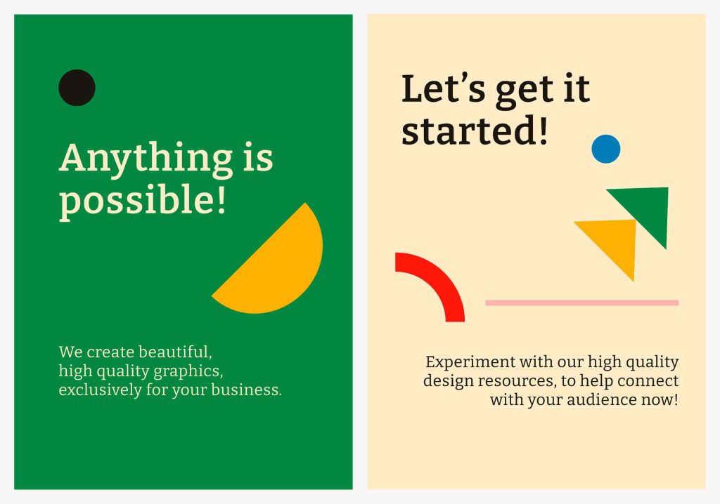
Negative space, often referred to as white space, is a fundamental concept in design that extends beyond mere emptiness. Rather than representing a void, it serves as the breathing room that allows the positive elements within a composition to truly stand out. The deliberate incorporation of negative space into design is akin to an artist’s careful consideration of the spaces between brushstrokes, essential for creating a masterpiece.
One of the primary virtues of embracing negative space is the profound impact it can have on the overall visual experience. It introduces a sense of balance, ensuring that no single element overwhelms the viewer. Just as a well-composed piece of music has moments of silence to enhance the notes played, negative space provides intervals of visual quietude that contribute to the overall harmony of a design.

Clarity is another key benefit derived from the intentional use of negative space. When designers judiciously leave certain areas untouched, they guide the viewer’s focus with precision. This not only streamlines the communication of the intended message but also prevents visual clutter, allowing the audience to engage with the design more effectively.
Sophistication is inherent in designs that skillfully incorporate negative space. The ability to discern when to let elements breathe and when to tighten the composition reflects a nuanced understanding of visual aesthetics. It is a mark of design maturity to recognize that less can indeed be more, and that simplicity, when executed with finesse, can be a powerful tool for conveying complex ideas.
Furthermore, the intentional use of negative space serves as a means of emphasizing key elements within a design. By providing visual contrast to focal points, negative space directs the viewer’s gaze and highlights the most crucial aspects of the composition. This emphasis is not solely achieved through the positive elements themselves but is inherently tied to the spaces surrounding and framing them.
In essence, the incorporation of negative space into design is a deliberate and thoughtful process. It’s not about leaving areas untouched arbitrarily, but rather a strategic choice to enhance the overall impact of a visual composition. The designer, much like a conductor leading an orchestra, orchestrates the interplay between positive and negative space to create a symphony of balance, clarity, and sophistication that resonates with the audience. In the realm of design, the artful use of negative space is a testament to the designer’s mastery in allowing both the seen and the unseen elements to harmonize seamlessly.
Enhancing Focus and Legibility
the strategic use of negative space emerges as a powerful tool for directing attention and delivering a clear message. Whether applied to logos, posters, or webpages, the judicious utilization of negative space serves as a beacon, guiding the viewer’s gaze to the main message or focal point with precision.
Consider a logo as a prime example. A well-designed logo is not merely a symbol; it’s a visual representation of a brand’s identity and values. By incorporating negative space, designers can sculpt the space around and within the logo to draw attention to specific elements. This intentional use of negative space ensures that the audience’s focus is directed towards the core aspects of the logo, allowing for a swift and impactful recognition of the brand.
Similarly, in the realm of posters, where the goal is often to convey a message swiftly and memorably, negative space plays a crucial role. A cluttered poster can overwhelm the viewer, diluting the impact of the intended message. By strategically employing negative space, designers create a visual hierarchy, ensuring that the key information stands out prominently. This not only enhances readability but also facilitates a quick and efficient understanding of the poster’s content.
In the digital landscape, where attention spans are fleeting, web designers leverage negative space to optimize user experience. A webpage that is overly crowded with content can be overwhelming, causing visitors to disengage. By thoughtfully incorporating negative space, designers provide a visual reprieve, allowing users to navigate the webpage with ease. This intentional spacing ensures that the essential elements, such as call-to-action buttons or important information, are readily apparent, enhancing the overall user experience.
The essence of utilizing negative space lies in its ability to prevent visual clutter. It acts as a visual decluttering agent, enabling the audience to grasp the intended message swiftly and effortlessly. When negative space is artfully integrated, it doesn’t just create empty gaps; rather, it serves as a framing device, enhancing the prominence of the design’s core elements.
Whether crafting a logo, poster, or webpage, the deliberate use of negative space is a design strategy that transcends mediums. It is a dynamic tool that not only prevents visual chaos but also ensures that the essence of the design is communicated clearly and effectively. In the realm of design, the art of utilizing negative space is akin to orchestrating a visual symphony, where every pause and every note contributes to the harmonious reception of the intended message.
Conveying Simplicity and Elegance

In the expansive canvas of design, the timeless adage “less is more” resonates profoundly, finding its embodiment in the elegant and transformative power of negative space. A minimalist approach, characterized by the intentional use of ample negative space, stands as a testament to the profound impact simplicity can have on design aesthetics. Think of iconic logos like Apple or Nike, where the judicious application of negative space elevates the designs to a level of timelessness and memorability.
The essence of a minimalist design philosophy lies in the deliberate choice to distill a concept to its essential elements, eliminating unnecessary embellishments. Negative space, in this context, becomes a crucial element in shaping the visual narrative. Rather than being perceived as an absence, it is an active player, contributing to the overall aesthetic by creating a sense of openness, clarity, and sophistication.
Consider the Apple logo—a sleek, bitten apple outlined against a pristine white background. The intentional use of negative space not only emphasizes the iconic apple shape but also imbues the design with an air of simplicity and purity. This minimalistic approach has become synonymous with the brand, underscoring the notion that sophistication often lies in the absence of excess.
Likewise, the Nike swoosh, a symbol recognized globally, exemplifies the power of negative space in design. The swoosh, a simple and fluid checkmark, is set against a clean canvas. The expansive negative space surrounding the swoosh not only enhances its visibility but also lends an aura of dynamism and motion to the overall design. This simplicity has etched the Nike logo into the collective consciousness, making it an enduring symbol of athletic excellence.
The use of negative space in these iconic logos goes beyond mere aesthetics; it becomes a strategic choice to create designs that withstand the test of time. A minimalist approach using negative space fosters a visual language that is easily digestible, memorable, and adaptable across various mediums and contexts.
In a world inundated with visual stimuli, the ability to distill a message to its core elements is a design skill of immense value. The sparing use of negative space, when done with intention and finesse, not only communicates a message with clarity but also leaves a lasting imprint on the viewer’s mind. In the realm of design, where trends may come and go, the enduring allure of negative space as a beacon of simplicity and elegance stands as a testament to the enduring relevance of “less is more.”
Creating Visual Illusions and Depth:

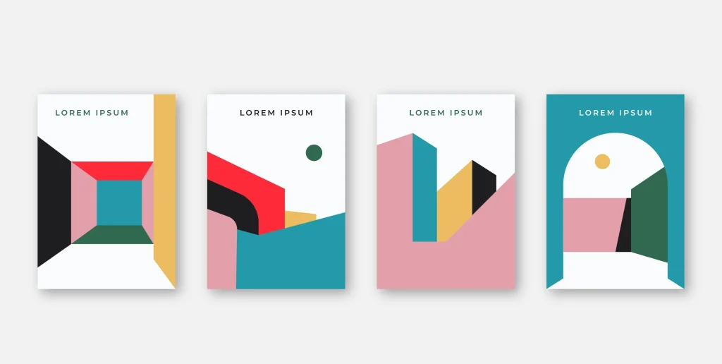
Negative space, often relegated to the background, is a dynamic and transformative force in design, capable of transcending its traditional role. Rather than a passive backdrop, it can actively shape the subject and breathe life into a two-dimensional design, offering a powerful tool for designers to create optical illusions that elevate the visual experience to a three-dimensional realm. This artful manipulation of negative space not only adds depth but also introduces an element of intrigue, engaging the viewer on a deeper and more immersive level.
The key to this visual alchemy lies in the intentional and clever use of negative space to deceive the eye. By deftly arranging positive and negative elements, designers can create illusions of depth and dimensionality that challenge the conventional boundaries of a flat surface.
Consider the classic example of the Rubin vase, an optical illusion where the negative space between two profiles forms the shape of a vase. In this case, the interplay of positive and negative space is used to create a compelling illusion, demonstrating that what is not there is just as crucial as what is. This principle extends to design, where the strategic manipulation of negative space can shape not only the immediate subject but also the viewer’s perception of the overall composition.
In the realm of graphic design and illustration, clever use of negative space can transform a flat image into a visually captivating experience. A well-placed absence of color or form can simulate shadows, highlights, and contours, giving the illusion of depth and tangible presence. This technique is especially powerful in logo design, where the juxtaposition of positive and negative space can create a sense of three-dimensionality, making the logo appear as if it exists beyond the confines of the surface it adorns.
This approach not only adds a layer of sophistication to the design but also invites the viewer to actively participate in the visual interpretation. The mind, enticed by the interplay of positive and negative space, is prompted to fill in the gaps and complete the illusion, fostering a more engaging and participatory viewing experience.
The manipulation of negative space to create optical illusions is a testament to the designer’s ability to transcend the limitations of a flat canvas. It adds a touch of magic to the visual narrative, transforming what may seem ordinary into something extraordinary. As designers continue to explore the potential of negative space as an active player in the design process, the boundaries of perception are pushed, inviting viewers to explore and appreciate the multidimensional stories woven into the interplay of what is present and what is purposefully left absent.
Establishing a Memorable Identity:
Indeed, logos stand as a remarkable showcase of the artful utilization of negative space to carve out unique and memorable brand identities. A stellar example that exemplifies this principle is the FedEx logo, where the hidden arrow nestled within the negative space between the “E” and the “x” adds a layer of subliminal messaging, elevating the design from mere aesthetics to intellectual stimulation.
The FedEx logo, a seemingly simple composition of purple and orange letters, conceals an ingenious use of negative space. The negative space between the “E” and the “x” forms a forward-pointing arrow, subtly symbolizing the company’s commitment to speed, efficiency, and forward momentum in its global delivery services. This hidden element serves as a visual metaphor, communicating a message beyond the literal representation of the company’s name.
The brilliance of such subtleties lies in their ability to engage the viewer on a deeper level. While the logo is visually appealing at first glance, it becomes intellectually stimulating upon closer inspection. The discovery of the concealed arrow creates a moment of revelation, prompting viewers to appreciate the clever use of negative space and fostering a connection between the brand and the observer.
This strategic incorporation of negative space in the FedEx logo is a testament to the power of thoughtful design in conveying messages that extend beyond the surface. It demonstrates that a logo is not merely a symbol but a narrative in visual form, capable of communicating values, principles, and aspirations. The hidden arrow, though unobtrusive, becomes a memorable element that adds a layer of sophistication to the logo, making it a standout example of how negative space can be harnessed to craft a logo that is both visually striking and conceptually rich.
As designers and brands continue to explore the potential of negative space, the FedEx logo serves as an enduring inspiration. It invites a rethinking of how seemingly empty spaces can be transformed into powerful communicators, enriching the viewer’s experience and leaving a lasting imprint on their perception of the brand. The FedEx logo, with its hidden arrow, is a shining testament to the notion that great design not only captures the eye but also sparks the mind, creating a memorable and intellectually resonant brand identity.
Practical Tips for Effective Negative Space Usage:
- Mindful Typography:
Pay attention to the space between letters and words in typography. Ample spacing enhances readability and gives a clean, sophisticated look to your text.
- Balanced Layouts:
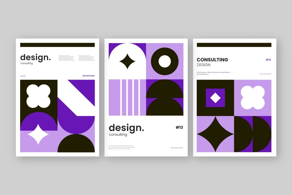
When arranging elements on a page, aim for a balanced distribution of positive and negative space. This creates a harmonious and visually pleasing composition.
- Use of Gestalt Principles:
Apply principles like proximity, continuity, and closure to leverage negative space effectively. These principles help organize information and guide the viewer’s perception.
- Experiment with Scale and Contrast:
Vary the scale of elements and play with contrasts between positive and negative space. This dynamic interplay adds visual interest and captivates the audience’s attention.
Conclusion
In the intricate dance of design, negative space is a silent but commanding partner. Its strategic use can transform a mundane design into a masterpiece, allowing the viewer to experience a seamless visual journey. By embracing the power of negative space, designers can not only communicate their message more effectively but also leave a lasting imprint on the minds of their audience. So, as you embark on your next creative venture, remember that sometimes, it’s what you leave out that makes the most significant impact.


